The Rise of M-Commerce and How to Optimize Your e-Commerce Site
The rise of mobile commerce (m-commerce) is a game-changer for businesses of all sizes. According to a recent report by Statista, m-commerce volume is expected to hit $620.97 billion by 2024. This trend underscores the importance of having a mobile-friendly website that is optimized for the growing number of mobile shoppers.
So, what is m-commerce, and why is it important for businesses to prioritize it?
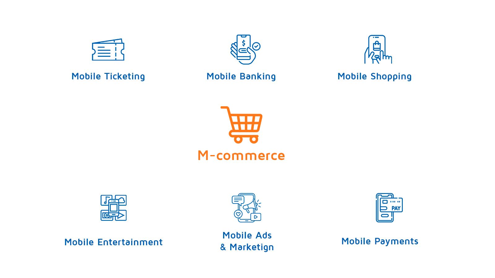
Simply put, m-commerce refers to the buying and selling of goods and services through a mobile device, such as a smartphone or tablet. M-commerce allows customers to shop on the go, making it a convenient and efficient way to purchase products and services. This is especially critical in today's fast-paced world, where customers are looking for quick and easy ways to shop online.
From a business perspective, m-commerce is a huge opportunity to reach new customers and grow online sales. However, it's not enough to simply have a mobile-friendly website. To truly optimize your e-commerce strategy for mobile, you need to consider factors such as responsive design, streamlined navigation, and mobile-friendly checkout processes.
Here are some tips for optimizing your e-commerce site for m-commerce:
1) Use a responsive design
A responsive design ensures that your website looks and functions properly on any device, whether it's a desktop computer or a smartphone. A responsive design means that your website is designed to adapt to the screen size of any device, so users can easily navigate and interact with your site, no matter how they access it.
When designing your responsive website, it's essential to focus on usability, readability, and navigation. Your site should be easy to use, with clear calls-to-action and intuitive navigation. Additionally, your site should be optimized for mobile speed, meaning that it should load quickly and be easy to use, even on slower mobile connections.
2) Simplify navigation
Mobile shoppers don't have the patience for complicated or confusing navigation. Make sure your site's navigation is simple and easy to use, with clear categories and subcategories. A well-organized site with clear navigation can improve user experience and increase the chances of conversion.
When designing your navigation menu, keep in mind that mobile users have less screen real estate to work with, so you need to be strategic in how you organize your categories and subcategories. Consider using a hamburger menu or other responsive navigation solutions to ensure that users can quickly and easily find what they're looking for.
3) Optimize product pages
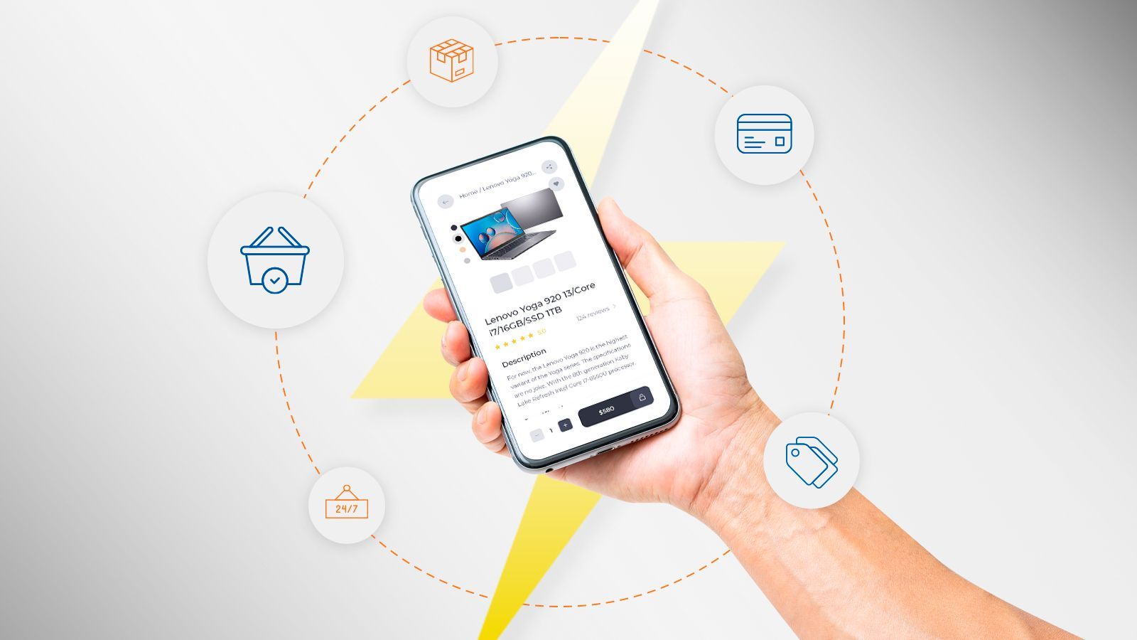
Your product pages are critical for converting mobile shoppers. Make sure your product images are high-quality, your product descriptions are detailed and informative, and that user reviews are prominently displayed.
When designing your product pages, focus on providing a seamless and user-friendly experience. Consider using high-quality images that showcase your products from multiple angles, and include detailed descriptions and product specifications. Additionally, you may want to consider adding user-generated content, such as reviews and ratings, to provide social proof and increase customer confidence in your products.
4) Streamline checkout
Long or complicated checkout processes are a major turnoff for mobile shoppers. Make sure your checkout process is simple and easy to use, with as few steps as possible.
When designing your checkout process, focus on making it as easy and streamlined as possible. Consider using one-page checkout solutions that eliminate the need for users to navigate through multiple pages to complete their purchase. Additionally, you may want to consider using autofill functionality to make it easier for users to enter their shipping and payment information.
5) Offer mobile-friendly payment options
Mobile shoppers expect fast and secure payment processing. Offer mobile-friendly payment options such as PayPal, Apple Pay, or Google Wallet to make the checkout process quick and easy.
Additionally, consider optimizing your payment process for one-click payments, which can reduce cart abandonment rates and improve the overall user experience. By offering a variety of payment options that are optimized for mobile, you can improve customer satisfaction and increase the chances of conversion.
Mobile commerce is a rapidly growing trend that businesses can't afford to ignore. By optimizing your e-commerce site for mobile, you can reach new customers, increase conversions, and improve the overall user experience. Remember to focus on responsive design, simplified navigation, optimized product pages, streamlined checkout, and mobile-friendly payment options.
By following these tips and investing in your mobile commerce strategy, you can stay ahead of the curve and meet the growing demands of today's mobile shoppers. With the right approach, m-commerce can be a powerful tool for driving growth and success in the competitive e-commerce landscape.
Want to learn more about how to optimize your site for m-commerce, set up a consultation with us at Integreat Commerce! ➡️
https://www.integreatcommerce.com/contact